Many people consider the homepage to be the most important page of a website. Acting as an introductory page, traditionally the homepage would be the first page a user would see on a site. It would receive more page reviews than any other page. However, over the last few years there have been many noticeable changes, with some people even questioning it’s importance.
Here are some examples of how the homepage has evolved.
How websites used to look and function
Fearing that users would not see all their content, editors and website owners would often crame their homepages with as much information as possible. This led to many being cluttered, unreadable and polluted with links. The Huffington Post website of 2005 is a great example of a site that tried to cram too much content on to the homepage. Clearly, legibility and functionality were merely a second thought. However, 8 years on you can see how much it has improved.


Even Twitter back in 2006 was a victim of a cluttered homepage. Compare this to their homepage of today; Twitter have clearly decided to switch their attention to trying to get the user to login to the site rather than showing as much content as possible. They have removed all unnecessary content, like the “Recent Public Updates” section that may have distracted people.

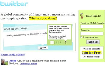
(Click Images to enlarge. Photo Credits Business Insider)
Reliance on search engines and social media
Audiences are now reliant on search engines such as Google and Bing, and social medial channels such as Facebook and Twitter to navigate the Internet. Many bookmark these sites as personal homepages and refer back to them to find other sites. They directly affect how users locate and enter a website; every page can be used as a possible entry to a website.
It could be that a user never even witnesses the homepage when visiting a site. Bob Cohn, editor of Atlantic Digital, argues that the “assumptions of what is a homepage are misconceived”. His studies into the number of homepage views revealed “only 13 percent of visits to Atlantic Digital start from the homepage”. Similarly, Joanna Pineda also completed a study into the usage reports of her blog, thematrixfiles.com. Sure enough, this too revealed “the homepage of this blog represents between 7-10% of the total traffic in any given month”.
This certainly suggests that the role of homepage has diminished due to the rise of search engines and social media channels as means of locating content. But does this make them less important? It turns out that for some time, other people have been thinking this, with some even declaring that the homepage is “dead”.
In 2010, Rick Stratton wrote the Death of the homepage, in which he states, “your homepage’s importance is dying”; our expectations need to also change. Ronan Sprake of Soak, a UK-based marketing agency, reveals that with time, his interpretations of the page have evolved from “being an introductory page, to an area I consciously navigate to for an overview of the site. We need to view homepages as acting more like a central hub rather that a gateway.”
Less text, more imagery
Many sites are currently adopting the approach of reducing the amount of text visible on their homepage. They are instead relying on imagery, icons and full width videos to convey information. Nest.com, for example, uses little text with strong product photography to create an uncluttered, minimalistic design. 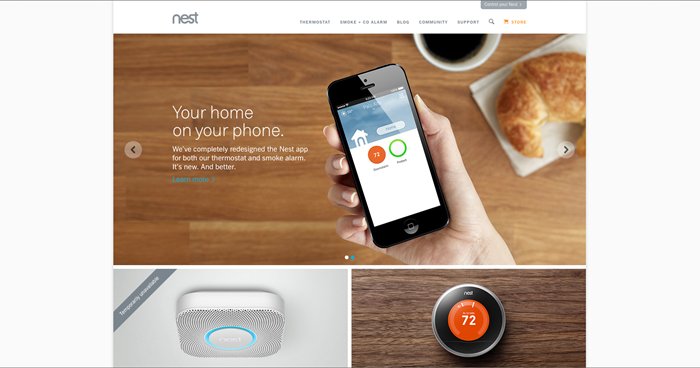
Sites such as Snapchat have instead opted to use video on their homepage. With fewer than ten words on the page the video is a clever way of showing the product in action. This limits the need for huge amounts of explanatory text. People may stay on a homepage longer to view a video, rather than be put off by reading huge amounts of text.
Then there are sites like The Music Bed, who use full width on their homepage to capture attention. Full width images have only recently been introduced to website design due to technological advances. While some oppose using videos on homepages due to their large file sizes and the way they affect a page loading speed, I argue that they are actually a great way of communicating complicated information. Plus everyone loves to watch a great video!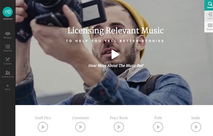
Long scrolling homepage tell stories in chapters
In the past, the positioning of content seen on a homepage was dictated by the location of the fold - the area seen on the screen before the user needs to scroll. "The fold" is a term used by newspapers, especially broadsheets, because they need to be physically folded for them to be readable. To make their papers as enticing as possible, editors put the most important information at the top of a page. Like so many print terms"the fold" was adopted by web designers, who started cluttering their homepages with the most important content at the top of the page and the least important at the bottom.
With screen resolutions constantly changing, the location of the fold becomes harder to determine. As more people use mobile phones and tablets to access the Internet, many are becoming accustomed to vertical scrolling. These have resulted to an increase in homepage lengths, with more sites spreading their content further down the page.
Companies such as Wirefox, The Facebook Grill, and Xero all use long scrollable homepages that tell a story as the user scrolls.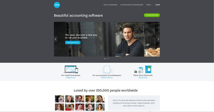
Long scrolling homepages are an effective way to divide and show content intuitively; they lend themselves to companies telling a story. Coupled with strong photography and the emergence of parallax scrolling, long scrolling pages are here to stay.
The homepage is dead – long live the homepage!
In my view the homepage is still regarded as the most important page of a site. However, as audiences become more reliant on search engines and social media to find what they want, all pages are now a possible entry to the site. This means that every page is now considered as a landing page and should be given equal attention to when designing. No longer is the homepage the sole gateway but just another hub for the site.
