In the past year or so, web design has seen the introduction of parallax scrolling. Parallax effect happen when two objects, one further away and one closer to you, move at different speeds. This causes their relative positions to change, giving an impression of movement. It’s an effect that astronomers use to measure distances to stars, and that the designers of Super Mario Bros. and Moon Patrol used to make it look like their characters were moving through a world. When games turned 3D parallax effects fell out of fashion, but recently they have seen a comeback on the web with background and foreground objects on a page moving at different speeds when you scroll.
Some designers regard parallax scrolling to be of a nuisance. They see it to be gimmicky and overwhelming, arguing that it can distract visitors from using a website correctly and creating a sense of confusion. I do agree that in some circumstances parallax scrolling is overused, and used inappropriately. But I do feel that when used sparingly, and used in the correct manner, parallax scrolling enhances a visitor’s user experience. It can be used to give a website depth and dimension, with many large brands including Apple Inc and Spotify.com using the technique to great effect.
Here are some examples of websites that use parallax scrolling, some to better effect than others.
Apple’s Mac Pro site is probably the best known example of a site using parallax scrolling. Being a huge fan of their products, it will come to no surprise that this site is one of my favorites. By using parallax scrolling, Apple demonstrates the main features of the product by rotating it 360 degrees. This not only lets the user to get an overview of the product but also allows them to stop the rotation and take a deeper look at a particular view. This would not have been possible in a video, as the user would have to pause and reply the video in order to view the product. 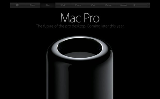
Spotify.com has a beautiful scrolling background that uses parallax. Clever use of powerful full width imagery separates the site into sections, allowing the user to essentially walk through a story just by scrolling down the page. Like the Apple’s Mac Pro website, this is one of my favorite websites that use parallax scrolling. I particularly like the site’s minimalistic approach, great typography and strong photography that are used with parallax scrolling to enhance the design.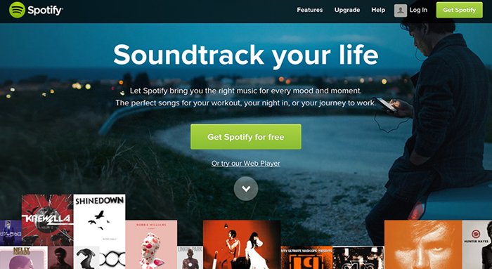
The Q, the world’s first social camera that uploads your photos to the internet, has a great website that illustrates the benefits of parallax scrolling. The site combines parallax scrolling with powerful photography to illustrate the benefits of the product. 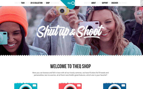
Surely a government website wouldn’t be employing a relatively new technique such as parallax scrolling to engage with it’s users? But indeed the Whitehouse.gov does. The Whitehouse use parallax scrolling to demonstrate a timeline of the Iraq war, and although the subject is sensitive the site remains tasteful and unique.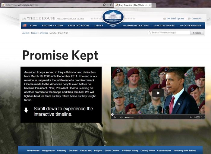
The Activated Drinks Company are a great example of a brand that uses parallax scrolling to market their product well. They use it to narrate the story of the brand, moving the background and site content at different speeds. This gives the site an impression of depth, with the user seeing multiply layers. I particularly like how the brand has decided to use the bubbles of the drink to guide the user when scrolling.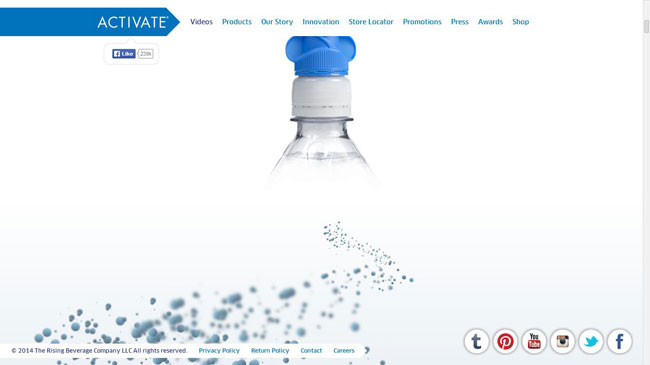
Whiteboard, an interactive design agency based in Chattanooga, Tennessee, have effectively chosen to use parallax scrolling sparingly, combining it with videos of their staff working in their offices. This creates a professional but friendly tone, giving the potential customer an insight into running of the company. A nice example of a website using the technique as an enhancement to the design and not as the design itself.
Unlike the guys at Whiteboard waaac.co, a design duo consisting of Nimrod Gavish and Guy Tubul, decided to place a greater emphasis on parallax scrolling. They use technique to divide the site into sections, with the content only becoming visible when the site is scrolled. I think using parallax scrolling to divide a site into sections is a good use of the technique; it stimulates the user, keeping them interested in the sites content.
Dangersoffracking.com is a site built to inform the user of the dangers of fracking, a procedure used to extract oil from the ground. Even though I like the use of parallax scrolling on this site, some of the pop-ups that appear when scrolling can only be seen briefly. Showing information sparingly and only for a short scroll length like this can lead to information being missed could lead to the user missing the information or require them to scroll back to see it.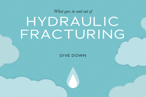
The whois.wildlife.la is a great example of a website that illustrates why some people feel negative about parallax scrolling. Users of the site could easily become confused and overwhelmed by all the different types of animation that happens when you scroll and. the site’s reliance on parallax scrolling makes it heavy, so you have to watch a loading bar before entering. That and the strange cursor make me just want to leave the site instantly.
The Wild Goose, a restaurant based in Ohio, America, have a promotional website that informs users of their menu and location. When you use full-width images on a website they have to be good, and these aren’t. Parallax should be used to compliment a site’s design, but it feels The Wild Goose have used it for the sake of using it not because it enhances the visitor’s experience. There are also some elements, which move too fast and too far compared to the background, like the drinks cans that end up blocking the map at the bottom of the page.
Sites like theqcamera.com and spotify.com work more effectively as they use subtle parallax scrolling that is complimented with strong photography. The Wild Goose should have used larger slides, more subtle movement, and placed a stronger emphasis on photography of their dishes and location. On the up side, their pizzas do look rather good.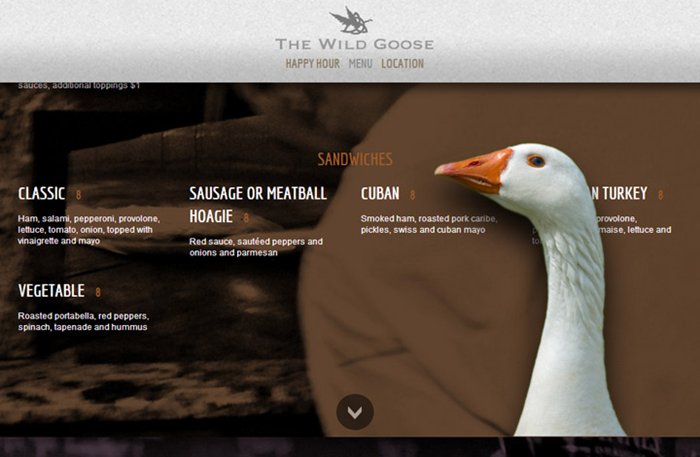
Conclusion
Parallax scrolling is an exciting new way of presenting a websites. With more and more brands turning to the technique to differentiate their websites from that of their competitors, I believe parallax scrolling is here to stay… for now. When used in the correct manner, it can be effectively used to catch a users attention, and add depth to a website. However, when over relied upon or executed badly, parallax scrolling can create a confusing website, one which distracts the users attention. It can also effect a website loading time, creating a sluggish website and a poor user experience. Parallax scrolling should be used sparingly, to enhance a websites design and user’s experience.