For any business selling online, customers abandoning their checkout is a major frustration. According to Baymard.com the average abandonment rate for online checkouts is 68.53%. So what can we do to ensure that our customers do checkout? Below are 5 ways to increase your checkout conversion rate.
Forced Registration
Should e-commerce sites require shoppers to register before they enter the checkout process? The simple answer is no. Forced registration is part of the 'greedy marketer' syndrome deployed by e-commerce sites that hope shoppers with an account, get 'locked in' and start spending more. But how true is this? Studies by Toluna found a staggering "25.5% of online users would actually abandon their baskets if forced to register first". So don't be greedy and force shoppers to register first. It not only infuriates your shoppers but also stops them from achieving their goal. Instead put the shopper in control - allow them to decide if it is worthwhile to register or not. Before they enter the checkout, clearly state that registration will be optional. Those who wish to register can and for those who do not, offer the option for them to ‘continue as a guest’.
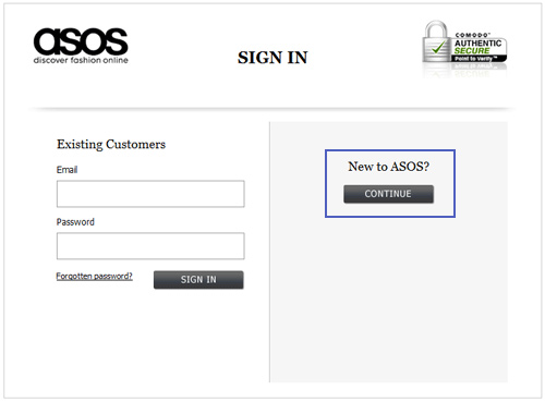
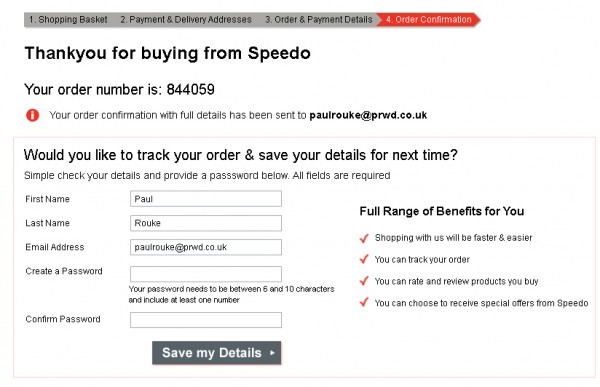
Two retailers who recognize the importance of optional registration are ASOS and Speedo. Both sites allow their customers the choice of optional registration but choose to display it at different stages of the checkout process.
Like many others, Asos choose to offer the customer optional registration at the beginning of the checkout process. By offering optional registration, coupled with removing any reference to "creating an account", Asos have seen "abandon rates on the page reduce by 50%".
Speedo however, chooses to do things differently. They simply ask the customer to continue with the checkout, providing them with delivery details, etc. and offer account creation on the confirmation page, at the end of the checkout. This is extremely clever by Speedo, as they can offer to create an account instantly because the customer has already provided them with information. By moving the register to the end of the checkout the customer is not interrupted and is more willingly to accept. A reported 75% of new customers stated that they would choose to create an account at the end of the checkout.
Progress Bars
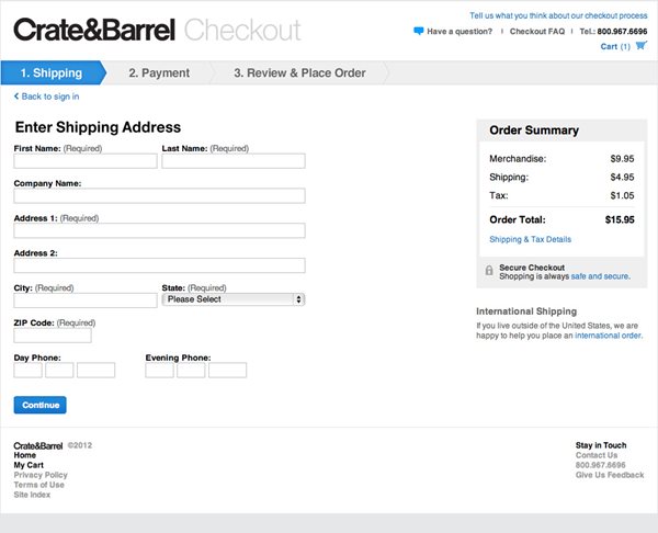
It is vitally important throughout the checkout that the customer knows where they are within the process and what needs to be achieved. The checkout is perhaps the least exciting part of the experience, and a progress bar helps illustrate how many steps are involved and reminds the customer that the end is in sight. Try not to drag out the number of steps, and aim for no more than three or four. When a customer has completed a step, it is important to illustrate this in the progress bar. This can be shown, for example, by turning the completed step green. The use of an arrow shaped form for the steps (as shown by Crate&Barrel) gives the impression of movement, making the customer feel they are moving along the process.
Enclosed Checkout
An enclosed checkout is essentially the removing of unnecessary distractions from the header and footer. By isolating the checkout, we offer the customer only one-way movement towards checkout completion. This focuses them on completing their purchase. It is vital that an enclosed checkout only displays the relevant information, like items in the basket, payment method and shipping methods. A link for customers to continue shopping should be provided, along with any policy links (returns and shipping) and contact information.
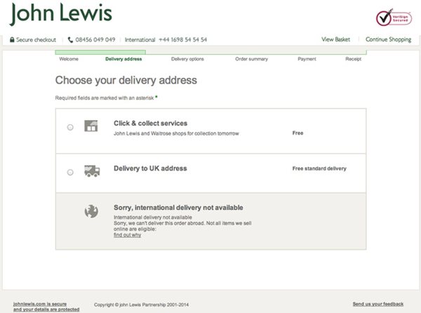
John Lewis has a great example of an enclosed checkout. They have successfully removed all distraction from the page. Links to key information open in a pop-up window, which is easy to close, and keeps the customer on the page.
Keep forms simple
Poor form design in the checkout process is definitely a contributing factor for customers abandoning their checkouts. Nobody enjoys filling out forms, so try making the process as hassle-free as possible. It was previously thought that customers completed forms by only filling out the bare minimum required. However, research shows customers actually approach forms with “voluntary over disclosure behavior”. This means they will regularly offer more information than is required. So make sure to label your forms as optional and not required.
Make sure you pre-populate fields with information you have already obtained. This will make sure customers are not entering information in for a second time.
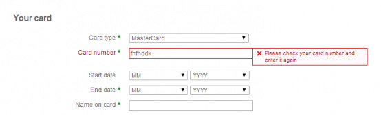
When it comes to validating forms, use form field validation, ideally as the details are being entered. This will ensure forms do not need to be submitted in order for the customer to know if anything is wrong.
Trust logos
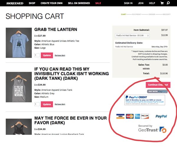
Displaying trust badges within your checkout plays an important role in helping you gain the trust of your customers. It reassures them that their transactions are secure, that their privacy is protected, and that the site is safe from hackers. In some surveys, as many as 61% of customers said that they had decided not to purchase a product because it was missing a trust logo. So make sure you proudly display your trust logos and stop those checkout abandonments. Logos to look out for include Paypal, Versign and TRUSTe.
Conclusion
As you can see, there are numerous ways in which e-commerce sites can improve their checkout conversion rate. By implementing just a few of these simple steps, you can reduce the number of abandoned checkouts and improve your online service.
