Whether you’re designing for print or web, pairing fonts isn’t easy. Each font has its own voice, so finding pairs that work together and don't conflict can be difficult to get right.
Choosing fonts shouldn’t be underestimated; when done correctly they can help engage with the audience and provoke positive emotions. A good font will increase the reading pleasure for the user.
Within this post I will be concentrating on why web designers should be referring to Google Fonts for their fonts and revealing my favourite 5 combinations.
Before Google Fonts, designers were limited in their choice of fonts. Websites could only render fonts that were installed on the user’s computer, many therefore deferred to standard fonts like Arial, Times New Roman or the dreaded Comic Sans. Choosing was simple.
But, in 2010 with the introduction of Google’s Web Fonts, a vast array of free fonts became accessible to designers. Users no longer needed fonts to be installed on their computers, they simply needed the fonts to be embedded within the site. The choice in fonts simply exploded, and there are now around 600 fonts available via Google Web Fonts. Searching for the correct combinations can be overwhelming and time consuming. Many are awful but there are some that deserve a closer look.
Before we get started, there are a few basic rules for which to consider when combining fonts.
-
Use font families This will allow you to use variants of the same font.
-
Go for contrast. Using two fonts that are similar means they will lack contrast. So try pairing a slab serif with a light sans serif font.
-
Limit yourself to only a few fonts. Try to keep to two fonts, if that’s not possible stop at three.
Here are my favourite 5 Google Web Font combinations that will hopefully inspire your next project.
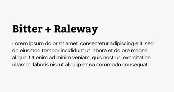
Bitter & Raleway
Designed by Sol Matas for Huerta Tipografic, Bitter is a “contemporary” slab serif typeface that looks great when used as a heading. Its characteristic curves make it stand out amongst other serif typefaces. We suggest pairing Bitter with a thinner font, like Raleway, for the body copy. Raleway is an elegant sans serif font that was initially designed mainly for headings, however I personally feel it works great for body copy when used correctly. Keep Raleway as large as possible to combat its fonts thinness.
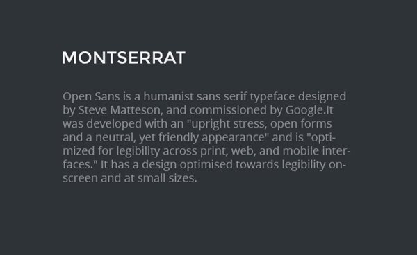
Montserrat & Open Sans
Monstserrat is a sans serif typeface designed by Argentinean designer Julieta Ulanovsky. Old posters and signage from the traditional neighbourhoods of Buenos Aires influence the fonts design. It commands attention and when combined with the delicate Open Sans creates a mature, sophisticated look.
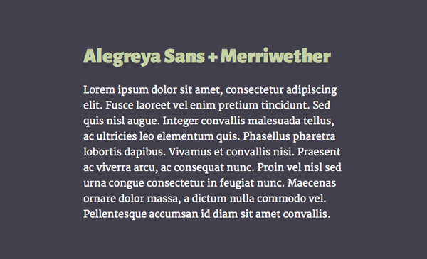
Alegreya Sans & Merriweather
Alegreya Sans is the sans-serif companion of its sister font Alegreya. It has a calligraphy inspired and humanist design that looks great used as a heading font. Sadly, Alegreya Sans is often overlooked in favour of more popular humanist fonts, like Cabin.
Due to the calligraphic nature of Alegreya Sans you should consider pairing it with Merriweather, a subtle serif font that was specifically designed to be easy to read on screens.
Playful Display & Roboto
Playful Display, as the name suggests, is a serif font that is well suited for headings. The font is reminiscent of typefaces that were popular from the mid to late eighteenth century, such as Baskerville. It comes with a large font family to chose from, with Playful Display Italics being especially beautiful.
Roboto is a minimal font that makes reading on screen enjoyable. Its versatility has made it one of the most commonly used Google fonts on the web. It can be paired alongside not only Playful Display but with many other heading fonts.

Open Sans Extra Bold & PT Sans
With similarities to font pairings you would find in newspapers or publishing, Open Sans and PT Sans are bold and straight to the point. Open Sans is hard hitting and attention grabbing, whereas PT Sans is more delicate and easy to read. These two typefaces complement each other perfectly.

In conclusion
I hope you find some of the font combinations above useful and inspiring. Pairing fonts can be challenging and time consuming, but they can equally be fun. Combining fonts not only makes your website easier to read but also helps communicate your message more clearly. Remember to limit yourself to only two or three fonts per site and to look for contrast between them. There are many font combinations out there so why not take a look and pair together fonts you may not have used before.
