As we say goodbye to 2015, lets take a look at some of my favourite websites from the year.
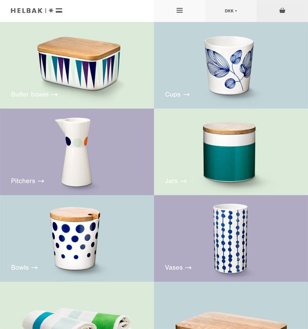
Halbak is the ecommerce website of Danish ceramist Malene Helbak. The site is clean, colourful and minimal just like the products. Interestingly, the so called “Hamburger menu” is used on both desktop and mobile views. I feel this suits the site as it is in harmony with the rest of the design. I hope that in 2016, more sites will opt to use the “Hamburger menu” in their desktop design.
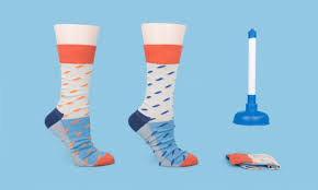
Odd Pears is a company that sells fun, colourful socks in Pears, not pairs. A Pear is three individual socks two that match and one that is slightly different. You can browse their socks by themselves or by the patterns. The site is bold, fun and inspiring, and will bring a smile to your face, its well worth a visit.
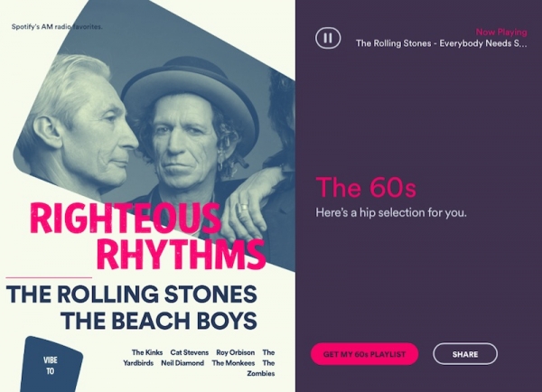
Taste Rewind is a new interactive site from Spotify, that uses your current music tastes to generate playlists of music from the past. It is a fun way of discovering music from the past, which you may not have heard before. The site looks really fresh and modern, especially the striking colour seen in the artists cover art. I really like lucid animations used to illustrate the user travelling through the decades. Great job Spotify!
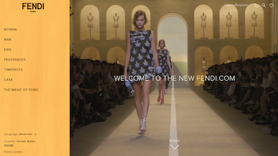
Earlier this year Italian fashion house Fendi released a new website for their European market. The site uses great photography and has some nice interactions. In particular, I really like how they have opted to use a traditional left hand navigation, which isn’t as common as it used to be in websites. For this reason, it feels modern, and makes the site standout from it competitors. It would be great to see other brands be as daring as Fendi.
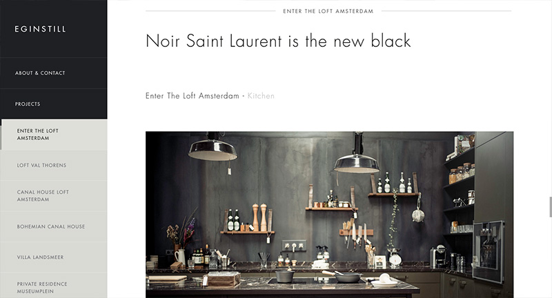
Eginstill is an interior design studio based in Amsterdam. Similar to Fendi, Eginstill also use a left hand navigation that scrolls through their case studies. The site is simple but has lots of small interactions, which keeps it interesting. There is a great effect on the images as you scroll, a mask reveals more of the image and moves slightly to give the site a sense of depth.
In conclusion
Some fantastic websites emerged in 2015, with an increased focus on being easy to use across all devices, as well as having beautiful designs. 2015 also brought a mini revival of the left hand navigation. Trends in web design, like in fashion, come and go, but there are three, which I predict will stay around through 2016 .
Firstly, the use of a hamburger menu for navigating desktop sites. Many have already adopted this for mobile and users are becoming more familiar to the icon so I see it becoming even more common in desktop sites.
Parallax scrolling is no longer a new trend, but I do expect to see more in 2016. The parallax technique allows the foreground and background content to scroll and different speeds and creates the illusion of depth, adds another dimension to a site and makes it stand out amongst others.
Finally, I predict more sites will replace hero banners with background animations and videos. A trend already adopted by brands such as AirBnB and Google, video backgrounds are a great way to capture the users attention. I especially like when sites put a gentle movement on an entire image.